I’m still working on Fanmode‘s look and feel.
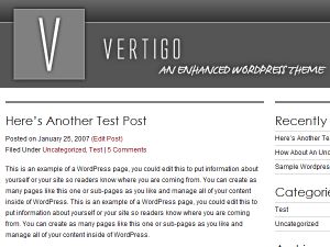
I chose Brian Gardner’s Vertigo theme for the new site and I’m really happy with it. Vertigo looks like it was designed by a pro.
Which, of course, it was.
It’s an understated and elegant theme that functionally, does all the basics well. Reading the text is easy on the eyes and navigating through the site is straightforward.
The theme comes in two versions: two- or three-columns. I chose the three-column flavour because I wanted a separate column to accommodate an ever-lengthening blogroll.
The theme was released under a GPL license so I was free to modify it which I duly did. I altered the header so that the site name was prominent (Gardner thoughtfully provided a blank header file to make it easy to customise it) but otherwise I was quite pleased with it.
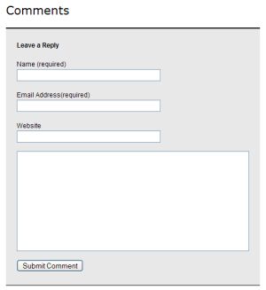
Vertigo does have one oddity I’m still trying to figure out, however. The comments box looks like this in Firefox:
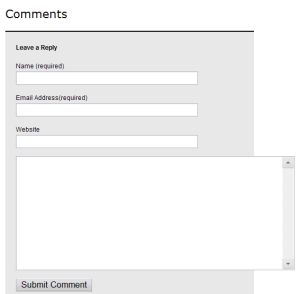
But it looks like this in Opera:
That’s something to put on the To Tweak list.
Anyway, Gardner has a few other themes available; some free, some not. Check them out if you’re shopping around for a spiffy new WordPress look.
